Artists often struggle with the same questions: How do I paint greens effectively? How do I create the effect of metal? What can I do to achieve a glow in my work?
A lot of it comes down to your values (see my last blogpost about finding the values in your reference) - but some of it also comes down to figuring out some solid colour mixes that you can have in your toolbox!
Where do you start?
I like to work with a limited palette as much as I can, it just helps me stay harmonious in my colour mixes. But there are times when you want to expand your palette for certain paintings. Knowing what the main colours are in your subject matter can really help you narrow down your palette. With so many available pigments out there, how do you know where to turn?
Check out this great article by Ingrid Christensen about how to select a limited palette on Artsy. She talks about how having three main primary hues can be a strength, but when you have to add a secondary (orange, green, or purple) it can be handy to have a tube of it available.
What’s a good limited palette?
Click on the image to see it up close.
For me, I like Cadmium Yellow Light (a cool, opaque light yellow), Quinacridone Rose (a lightish, cool, translucent magenta), and Ultramarine Blue (a dark, cool, translucent blue), with Titanium White (an opaque cool white) and Burnt Umber (a warm, dark semi-opaque brown).
Using these five colours, here are some of the basic colour mixes you can create:
Ultramarine Blue and Burnt Umber make a great black! Use more blue to make it a little darker if you want. Add white for a rich gray (more blues make it a cool gray, more browns make it a warm gray) - you can really have power over your grays when you mix them. Plus all of these other mixes - and MORE! Playing with colour is how you really learn to use it.
When it comes to my work, those five colours can express almost everything I need to express. There are times, however, when I need to paint a lot of greens, or make a turquoise, or have lots of oranges - any of those extra colours that it’s handy to have a tube of that colour, but when I do, I also try to remove other colours if I can. I try to limit myself to five colours if possible so that I avoid too much colour confusion/tension.
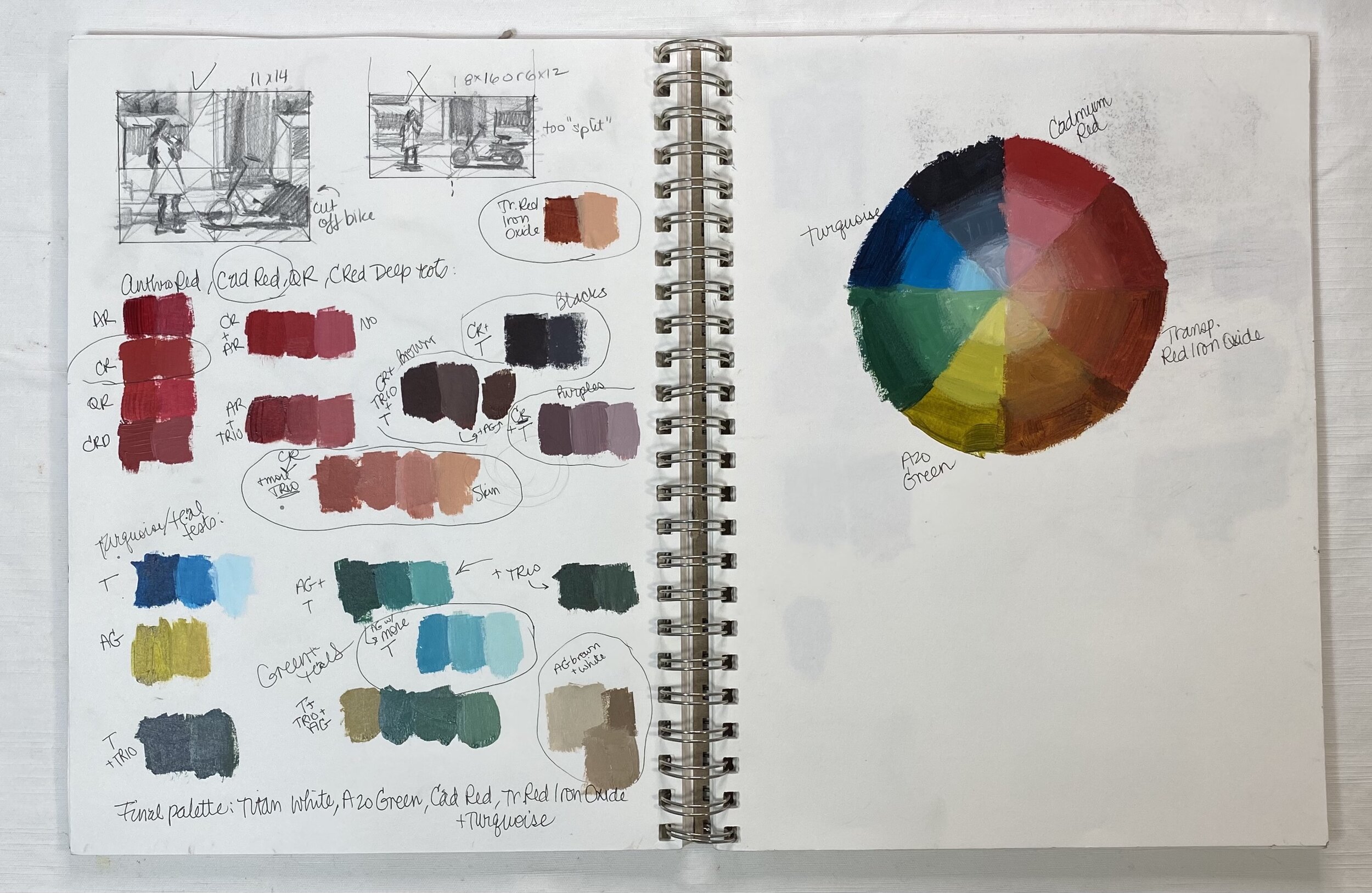
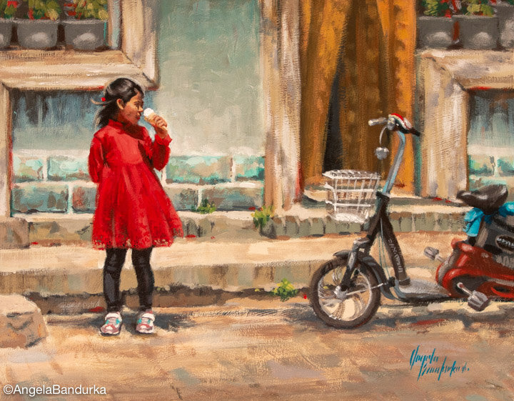
This example to the left shows a painting where I had turquoise and warm red that I wanted to play off of each other - so I swapped my Ultramarine Blue for Turquoise and Cadmium Red for Quinacridone Rose. But there were areas that I’d need to warm up, and the Cadmium Yellow and Burnt Umber didn’t combine well with this new palette, so after some experimentation, I went with Azo Green (a yellow-green that when mixed with white reads as yellow and cooled down the heat of the Cadmium Red) and Transparent Red Iron Oxide (a brownish red that, when mixed with white and a little Azo Green made a great skin tone for my figure). It’s only through experimentation and detailed note-taking that I found this combo.
But! That’s something you don’t have to worry about if you’re just starting out. If you’re a beginner, just using a standard palette that I described at the beginning of this article is enough to make some pretty standard mixes.
Putting it into action
The video below is one that I recorded during a workshop and it shows my tips for creating easy colour mixes for painting, but I did do it during a colour theory workshop where I had an expanded palette of warm and cool versions of each colour. So I added an Indian Yellow (a warm, translucent yellow), Cadmium Red (a warm, opaque red), and Cerulean Blue (a warmer, semi-opaque blue) to my palette. I go over creating the effect of metallic golds, skin tones, greens, and skies. These are just the tip of the colour-mixing iceberg, but I hope they help you!


